Complex infrastructure. Simple interface.
6 October 2026 · Dave Reid · 5 min read
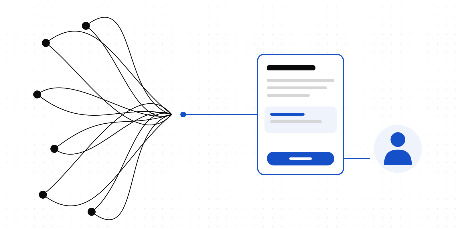
Deliverd has a new look. This post explains why, and what it is meant to do for the person on the other end of an agent's request.
The job of the interface
Deliverd sits between software that acts and people who answer for it. An agent wants to refund a customer, publish a board pack, or send something outside the company. A person has to decide whether it goes ahead, often on a phone, often between other things.
What sits underneath is not simple: policies, gates, stages, scopes, receipts, evidence. Very little of that should be in front of the person deciding. So every screen now tries to answer the same questions, in the same order:
- What is happening?
- What is being asked of me?
- Why?
- What happens if I say yes?
- Who asked?
- What evidence is there?
- What do I do next?
If a screen cannot answer those in a glance, it has too much on it.
One obvious thing to do
Every screen has one navy button. That is the action the page exists for: Approve, Publish, Ask. Everything else steps down: an outline for the alternative, a quiet fill for the rest.
This was harder to keep than it sounds. The empty "no reports yet" panel on Home kept its own navy button, right under the page's main action. The templates gallery put one on every card, which made it a wall of them. Each made sense alone, and together they told the reader nothing about where to start. There is now a test for the case we know we will be tempted to repeat.
Words before colour
Every status in the product now comes from one list, with one word, one tone and one icon each. Before, the same gate read "Approved" on one admin page and "A person said yes" on the next. Some pages coloured "suspended" the same red as "failed".
Now "Waiting for a person" is amber with a clock, "Refused by policy" is red with a shield, and "Expired" is grey. The word is always there and the icon repeats it, so nobody needs to tell amber from green to know what happened.
A serif, used sparingly
Page titles, headlines and the wordmark are set in Newsreader, a serif made for reading. Everything you read to operate the product is in Geist, the same as before. Code and IDs are in Geist Mono.
The serif signals that this is where the page starts and what it is about, and that is all it does. It is never used for buttons or labels, or for anything you have to scan quickly.
Two colours we changed after measuring
The palette is a warm off-white canvas, dark ink type, navy for the one action, and a pale blue for selection and focus. Two values in the original brief failed accessibility checks, so we changed them.
- Muted text was going to be a mid-grey that read at 4.0:1 on the canvas. WCAG AA asks for 4.5:1. It is now a shade darker.
- The bright brand blue read at 4.4:1 as text on the pale-blue fills. It is still the colour of charts and dots. Links and focus rings use a deeper blue that clears 5:1 on every background we use.
Those numbers are not kept in a spreadsheet. The test suite reads the colours from the stylesheet and computes the contrast of every text colour on every background. If someone nudges a grey to fix one screen and it drops below the line, the build fails and says which pair.
The composer does what it says
The landing page and Home both have a single input: What needs a yes? You type a sentence, choose approval, review or question, and press the arrow.
It is worth being clear about what that does, because the shape suggests something it is not. It does not run an agent. It does not stream a reply, and it does not pretend to think. It opens the page that already makes a request, with your sentence as the title, and that page asks who should decide. Nothing is sent until you choose. On the public site, a visitor without an account goes through sign-in first, and lands back on the same request.
We would rather the most prominent box on the page did one real thing than appeared to do a dozen.
Phones first, for the person deciding
An approval usually arrives in an email and is decided on a phone.
- The decision bar sits at the bottom of the screen, with Approve as a full-width 48-pixel button that your thumb can reach.
- Every other control is at least 44 pixels on touch.
- No page scrolls sideways at a phone's width. Tables and code samples scroll inside their own frames, and you can reach those frames with the keyboard.
We checked the public pages at six widths, from a small phone to a wide desktop, and ran an accessibility checker over them. The signed-in screens are only checked by their own tests so far. If you find one that misbehaves on your phone, we want the screenshot.
Where to look
Every colour, type size and component is on a public page: the design system. It shows the real components, not pictures of them, so when it disagrees with the product, the product is what changed. The emails we send, the cards that appear when you share a link, and the error pages now use the same palette.
Tell us what reads worse than it did. A redesign is a set of guesses about what people will find easier, and the only way to check them is to hear from you.